Hey
I’m the maker of PalettePoint — https://palettepoint.com
The problem
Choosing colors is one of the slowest parts of design. You scroll Pinterest, sample from photos, tweak in Figma… and still wonder if the palette actually works together.
What we built
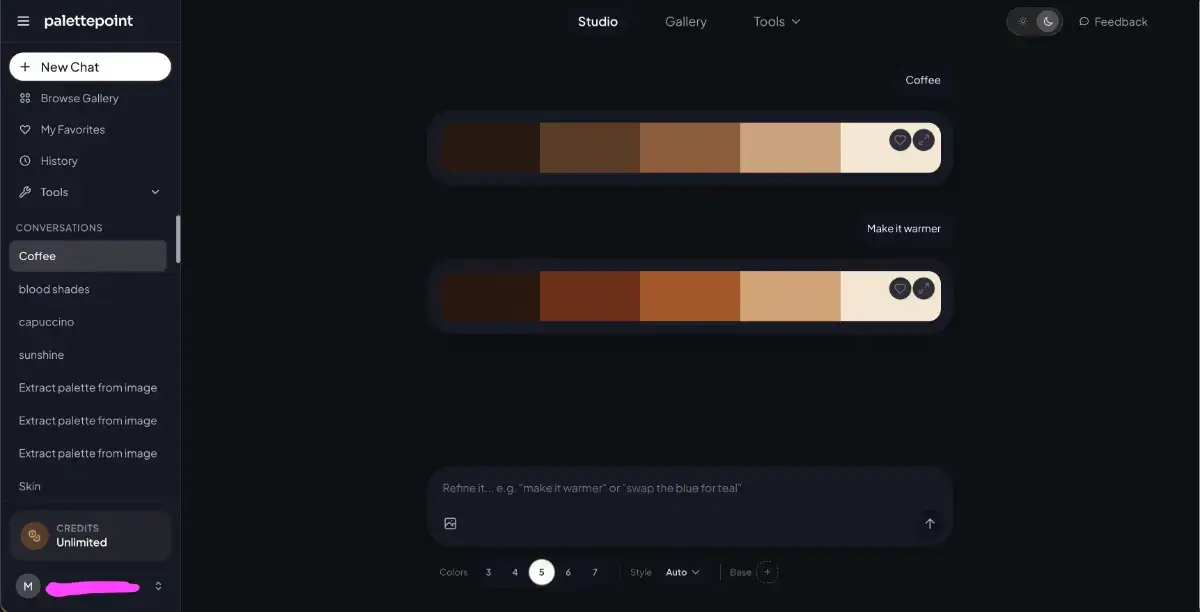
PalettePoint is a conversational AI studio for color. You don’t pick hex codes — you describe what you want:
Text → “Nordic winter, muted blues and soft whites”
Image → drop a photo, get a harmonious palette pulled from it
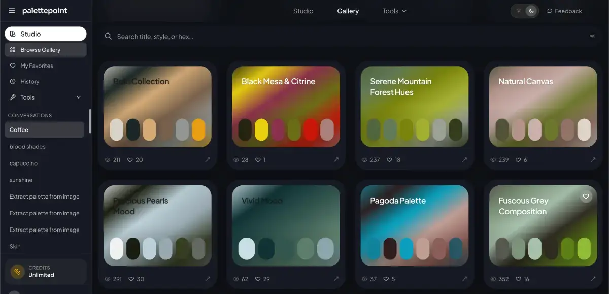
Gallery → browse 120K+ curated palettes by mood and style
Then you refine in chat: “make it warmer,” “add a pop of coral,” “fewer colors.”
What makes it useful beyond “another palette generator”
Named colors on every swatch (not just
#3B82F6)WCAG 2.1 contrast audit on every palette — see what passes AA/AAA before you ship
Export anywhere — CSS variables, SCSS, Tailwind config, JSON; copy individual colors in HEX, RGB, HSL, CMYK, Lab, and more
Palette card images — shareable artwork for social / mood boards
Figma plugin — generate and apply palettes without leaving your file
Free tools — contrast checker, image color extractor, gradient generator, color converter, mixer, harmony generator
Who it’s for
UI designers, brand designers, indie hackers, marketers, anyone who needs a cohesive palette fast and wants it to be accessible.
What I’d love from you today
Try the Studio with a weird prompt — I’m curious what you’ll get
Tell me what export format or workflow we’re missing
Upvote if color tools should be less painful 😄
Thanks for checking us out. Happy to answer anything in the comments.
https://palettepoint.com