What kind of icons would you design on an extremely tiny canvas of 16×16 pixels? If you are asking me, I would say: 1,350 Tinylicious icons.
———
Not your standard system icons
Let‘s be real. Those fine-looking icon libraries designed on a 24×24 pixels canvas that make your mouth drool feel a bit oversized in a typical web app interface full of forms, tables, and buttons. If you are a product designer like myself, you feel the pain.
That‘s why I spent a few months designing 1,350 tiny and delicious icons in the famous glyph style. For most icons, I would follow commonly-recognized and expected meanings, while for others I would break the rules and come up with something distinct. And believe me, you can still squeeze out plenty of creativity within the harsh boundaries of 256 pixels per icon.
———
Specifically crafted for dense layouts
Think icons alongside text labels in a button. Or just button icons. Or a horizontal stack of a few action icons in a table row. Or icon plus label in a drop-down item. You know where I‘m heading.
If you are a product or UI/UX designer crafting complex dashboards for web apps, consider giving Tinylicious a try, and then compare it with the other premium system icons. I did.
———
What makes Tinylicious different?
Not much. And it shouldn‘t. As a representative of system icons, they need to be utilitarian, universal, and recognizable at first sight. But I still infused a healthy dose of chunky and edgy character into them, making them look slightly informal, hoping to find their love with brands that play on the same tune.
———
To make each icon look coherent, I set myself a few guidelines:
1. Stick to a glyph style, unless the symbol by itself asks for lines.
2. Keep it super simple, to avoid customers saying, “What the *** that icon means?”
3. Round shapes only when necessary, to minimize sub-pixel rendering and maximize crispness.
4. Exaggerate the details, because they make a pictogram look recognizable.
5. Keep a 2-pixel division, to ensure icon components don‘t merge into an unrecognizable blob.
6. Make them to make you smile, because… why not?
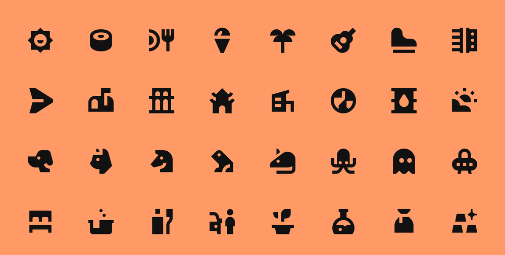
Tinylicious icons
1,350 tiny and delicious icons designed on an extremely tiny canvas of 16×16 pixels, pushing for maximum creativity at 256 pixels per icon.