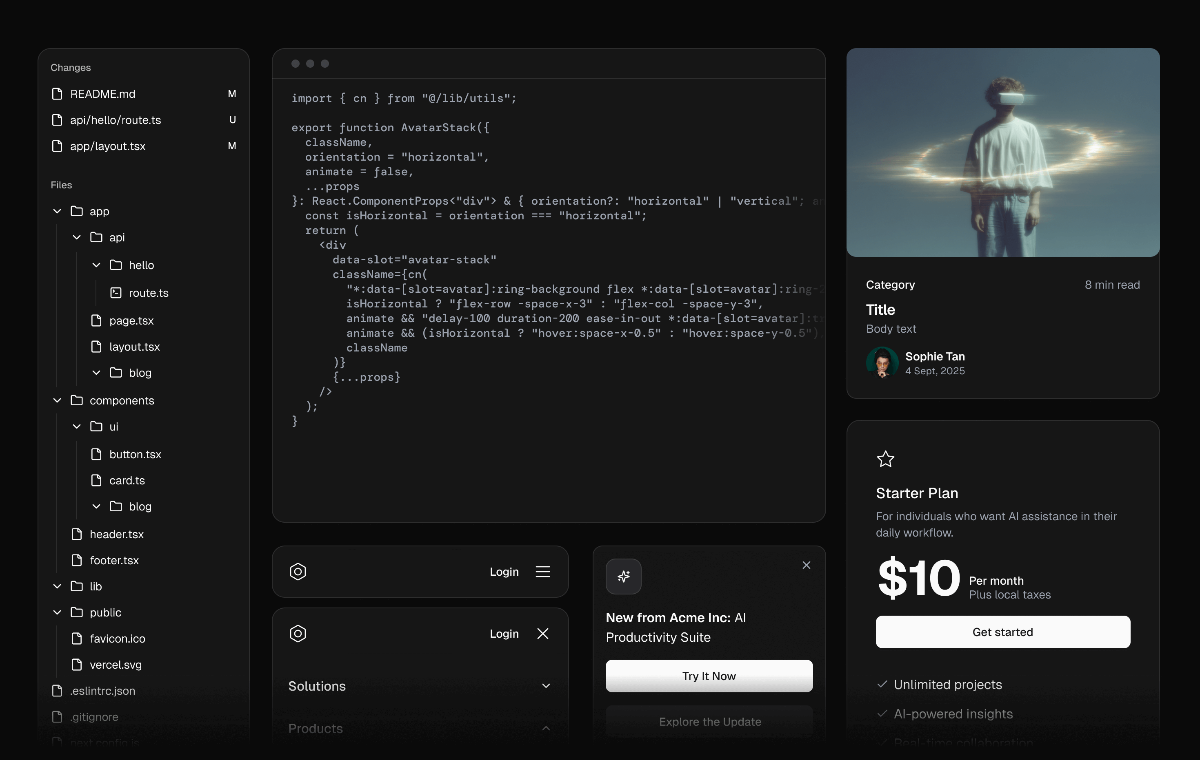

Complete shadcn/ui Coverage
Every core component rebuilt with clean structure, accurate spacing, and alignment across Figma and React so your designs and code stay perfectly in sync.
Pixel-Perfect Visual Parity
Designs match production exactly, with components crafted to mirror real behaviour and styling whether you’re working in Figma or shipping in React.
Figma-Native Craft
Built using modern Figma features including variables, auto layout, and proper nesting to keep files flexible, tidy, and faithful to how components work in code.
Ready for Fast Iteration
Drop assets straight into your workflow and move from concept to polished layouts quickly, whether you’re designing, prototyping, or coding.
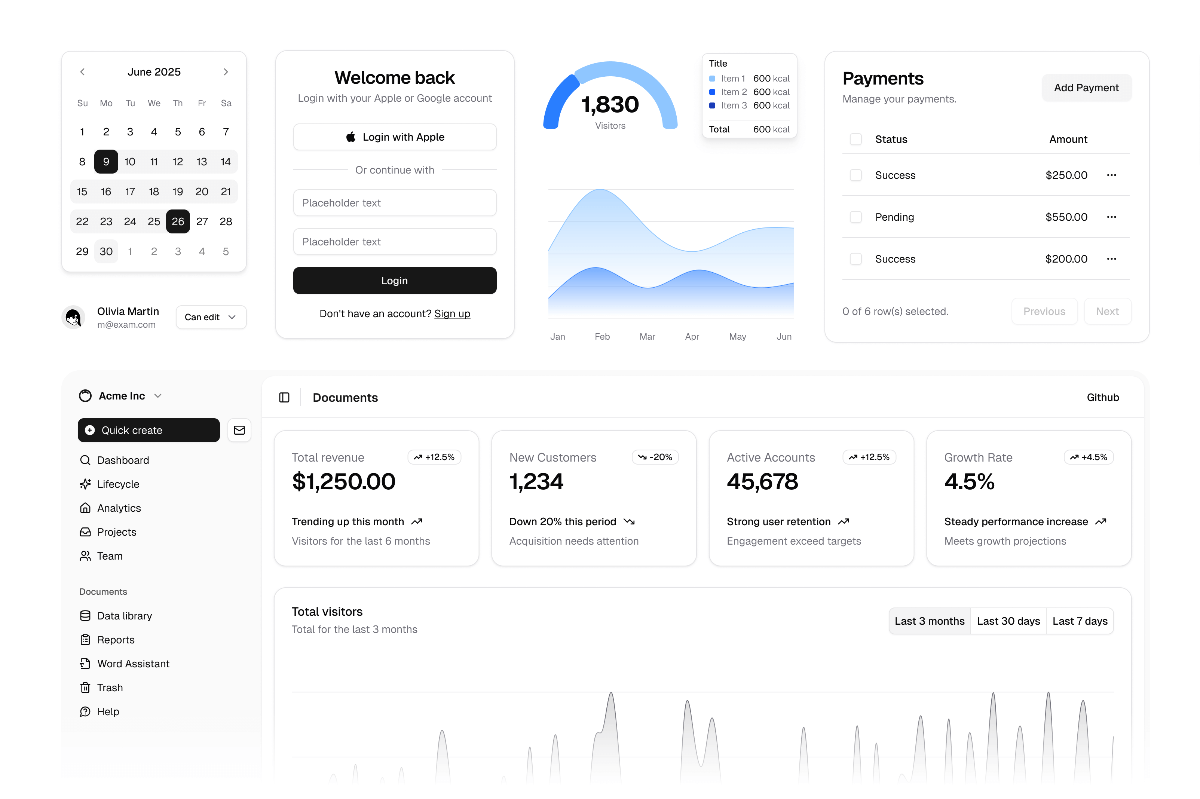
Reusable Blocks and Templates
A growing library of marketing blocks, common screens, and ready-made patterns that help you assemble complete pages with confidence.
Instant Theming with tweakcn
Swap themes, preview palettes, and customise tokens instantly without breaking component structure, making multi-brand work and rapid exploration effortless.